Abhiloans
Onboarding Redesign
Streamlining the path from sign-up to first loan for 500K+ users
- Role
- Product Designer
- Duration
- 3 months
- Tools
- Figma, Maze
Overview
Abhiloans (by Knab Finance) is a fintech platform trusted by over 500,000 Indians that lets users borrow against mutual funds, shares, and bonds, with funds disbursed within 4 hours and no impact on their credit score. I redesigned the onboarding flow to make the journey from sign-up to loan application fast, intuitive, and friction-free, directly targeting the high drop-off rates in the existing multi-step process.
The Problem
Getting a loan against your investments involves several financial and compliance-related steps. The existing onboarding required users to navigate through multiple stages before completing their loan application. Progress was not always clear, information had to be entered more than once, and users frequently dropped off at key moments, particularly during KYC verification and securities pledging.
The challenge was to make a complex financial process feel simple and predictable, without removing the steps required to complete it
Process
- Existing Flow Audit
- Journey Mapping
- Friction Audit
- Flow Restructuring
- Progressive Disclosure
- UI Design
- Flow Refinement
Approach
I looked at the onboarding journey as one continuous experience rather than a collection of individual steps. The goal was to reduce the cognitive load at each stage, make progress easier to understand, and give users the right information at the right moment.
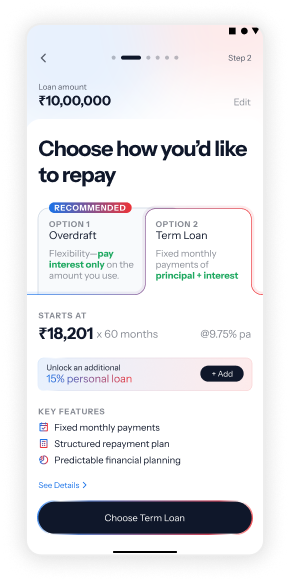
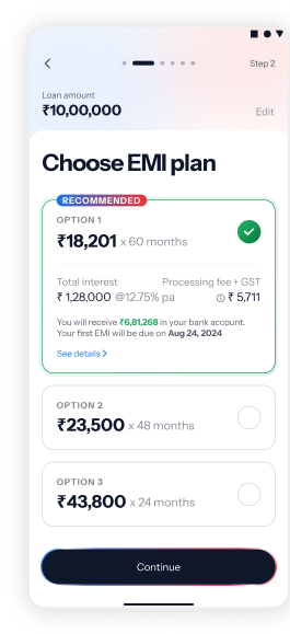
The redesigned flow introduced clearer stages, reduced redundant information, surfaced the loan summary earlier, and simplified financial terminology. For third-party and regulated screens that could not be redesigned directly, the experience was improved through contextual screens that prepared users for what was coming next.
Key Contributions
- Restructured the multi-step onboarding journey into clearer stages
- Reduced repeated information and unnecessary data entry
- Introduced clearer progress indicators across the journey
- Surfaced the loan summary early to set expectations
- Simplified complex financial terms such as overdraft and term loans
- Designed contextual screens to prepare users for third-party and regulated flows
- Refined the UI to create a more consistent experience across the onboarding journey
Outcome
The redesigned flow brought greater structure and continuity to a complex financial journey. Users could understand where they were in the process, what was required next, and what they were applying for without having to navigate the entire journey at once.
The experience made a multi-step loan application feel more guided while continuing to accommodate the compliance and third-party requirements behind the scenes.
At a glance
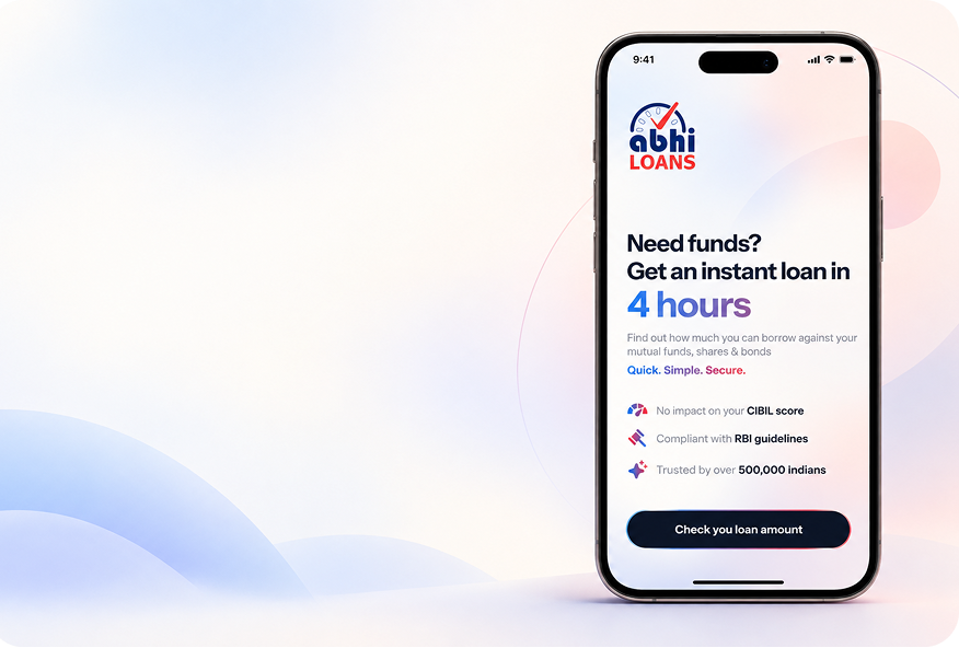
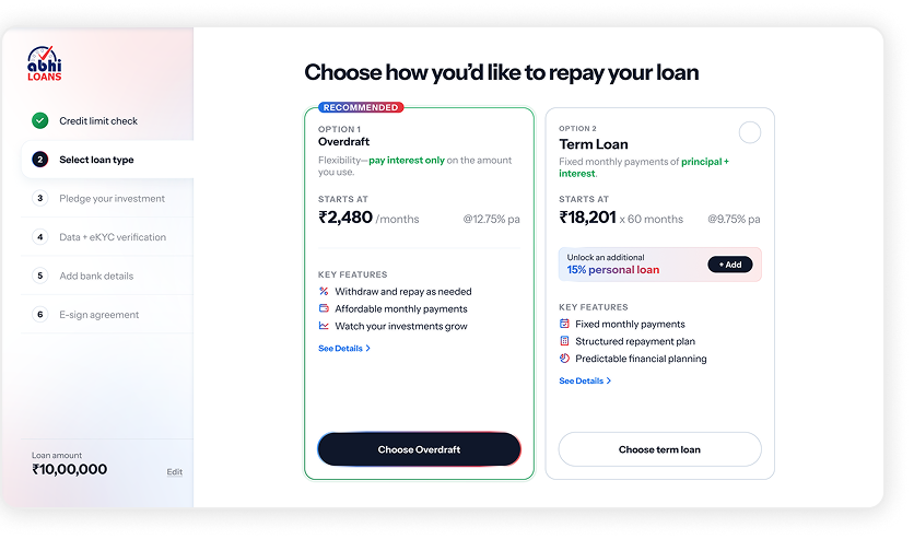
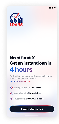
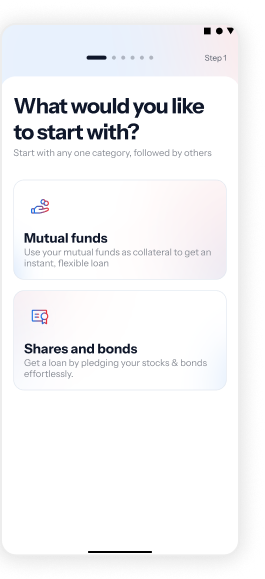

What I learned
Financial products often come with complexity that design cannot simply remove. The opportunity is to organise that complexity so users don't have to carry it themselves.