Epic
Redesigning the Explore Page for Epic
Making it easier for kids to discover something they want to read
- Role
- Product Designer
- Duration
- 2 month
- Tools
- Figma, FigJam
Overview
During my time at Epic, I worked across a range of product initiatives, from tackling churn and improving retention to designing cinematic content pages and rethinking how kids discover books.
Of all the projects I worked on, redesigning the Explore page was one of the most fun to work on. It brought together a lot of the things I enjoy about product design: understanding how people discover content, creating visual systems for large content libraries, and thinking about how the same experience should adapt across web and tablet.
The Challenge
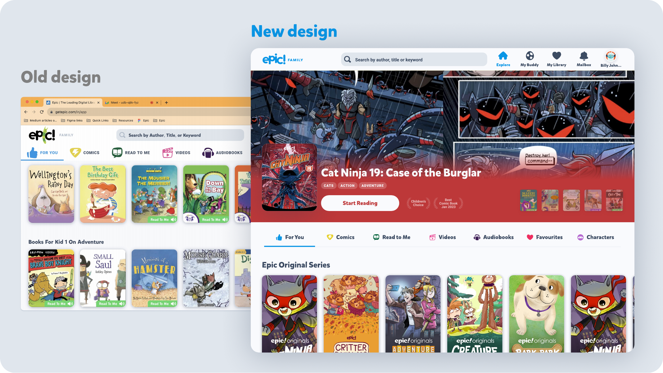
Kids don't always know what they want to read. They might be looking for books about a favourite character, trying to find the next book in a series, looking for something seasonal, or simply browsing for something interesting. The existing Explore experience relied heavily on rows of content and general search. This made it harder to discover content through specific interests and could feel overwhelming when many books were shown together.
The opportunity was to make discovery more visual, more varied, and easier to navigate.
Design Process
- Existing Experience Audit
- Discovery Patterns
- Content Organisation
- Explore Page Concepts
- Responsive Layouts
- High-fidelity Design
Approach
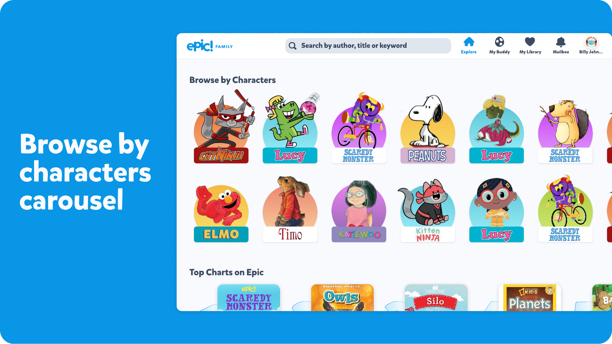
I looked at the different questions a child might have when opening Explore: “Show me books about my favourite character.” “Where's the next book in the series I'm reading?” “What are the popular books?” “I don't know what to read. Show me something interesting.” These became the foundation for rethinking how content could be organised on the page. Instead of relying on the same type of content rail throughout, the redesigned Explore experience introduced different ways to browse, including characters, topics, series, popular books, new releases and themed collections.
Key Contributions
- Redesigned the Explore page around multiple discovery behaviours
- Introduced Browse by Characters to help kids find books through familiar characters
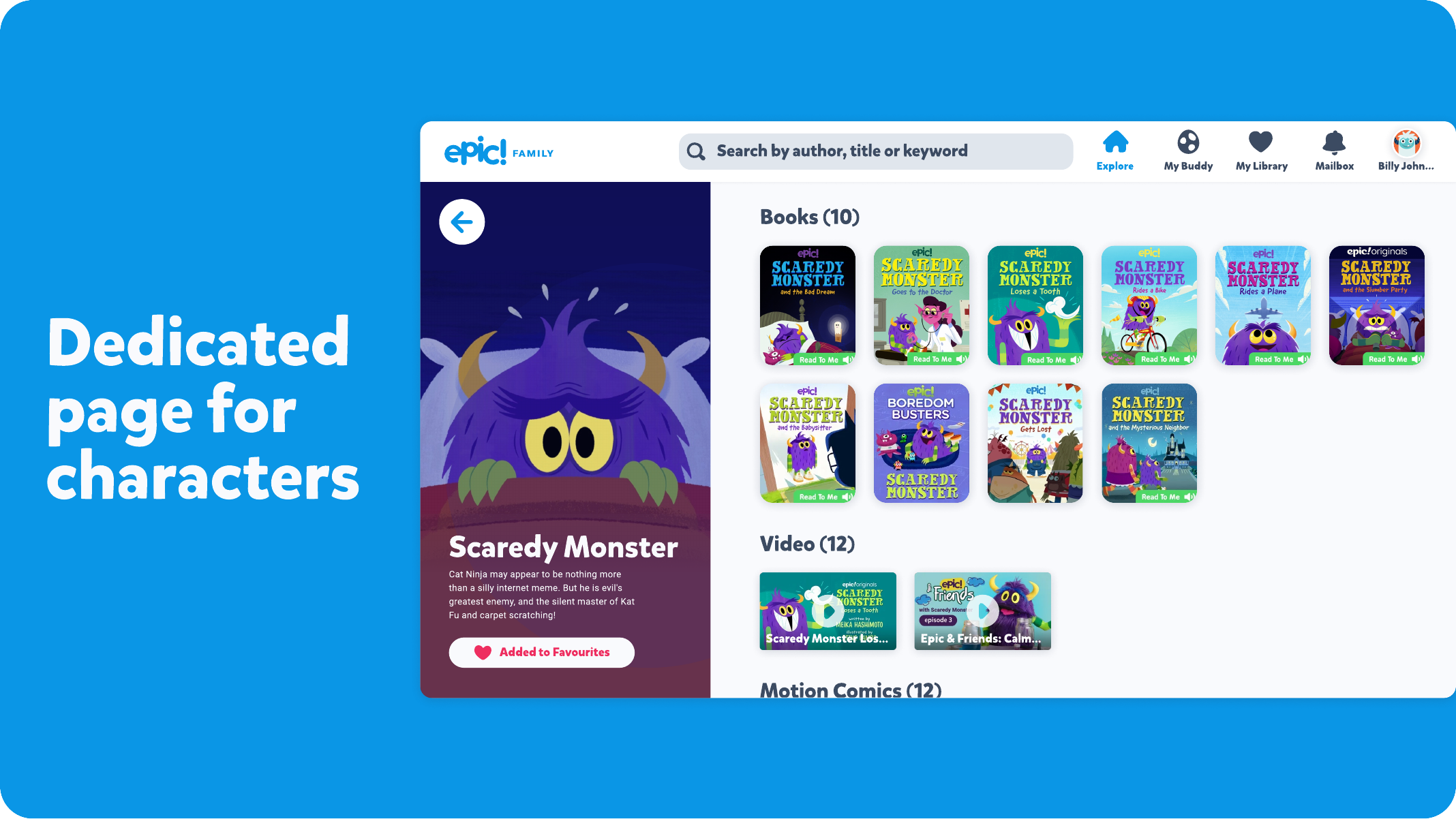
- Created dedicated character experiences with related books and content
- Added clearer ways to discover the next book in a series
- Introduced topic and theme-based discovery
- Created more distinct treatments for popular books and top charts
- Added themed collections around occasions such as Halloween and topics such as dinosaurs
- Reworked content rails to create more visual variety and hierarchy
- Explored responsive layouts that scale content density across different screen sizes
- Designed a 12-column grid system to adapt the layout between tablet and larger web screens
Designing for Different Screens
The Explore page needed to work across different screen sizes without simply stretching the same layout.
On larger screens, the existing layout could show too much content in a single row, making the page feel dense.
The redesign introduced a responsive grid and adjusted the number and size of cards based on available space, keeping the browsing experience more balanced across devices.
Outcome
The redesigned Explore experience created more ways for kids to discover books based on their interests, characters, topics, series and current context.
It also established a more consistent foundation for the Explore experience across web and tablet, while allowing the content density and layout to adapt to each screen size.
At a glance
What I learned
- For a content-heavy product, discovery isn't just about having more content.
- It's about giving people different ways into that content
- For kids especially, familiar characters, visual themes, series and curiosity can be just as useful as a search box when deciding what to read next.